

Introduction
I actually enjoyed this assignment. We got to use real code, and actually be creative. I was actually proud of the websites I created, and put effort into their creation. I utilized the format we were given for the original assignment, but changed all the content and added a lot of CSS. I used mostly basic HTML and my CSS included selectors and opacity modifiers. This really taught me a lot about how to format div tags, margins, and how padding works. I felt like the HTML workbook was a waste of time, since we already learnt everything by doing the course anyways.
Work
I really thought I did a good job of doing this assignment. The first section was the HTML Workbook. This was based upon our learning of the W3 Schools HTML course. We needed to fill in a summary of each chapter, and frankly it was quite time consuming. I learnt how to copy and paste code, and use it as an example well. I really thought the course worked pretty well, however I thought the workbook was a waste of time, only to prove that we did every chapter.
I was really proud of my websites. When I signed up for Web Development last year, this assignment was what I envisioned the course to be. The first HTML Project was the fashion blog. It was quite easy and barebones, and I probably did the skeleton project in under 40 minutes. There was no CSS, the font was the ugly default one, and it didn’t even need to be centered. This left a lot of room for design changes and personal styling.
What I think really set apart my website from the default was my use of the CSS Box Model.
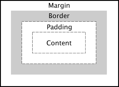
The Box Model is extremely simple, but mastering it is essential if you want to have a good website. Learning how this works and exactly how to space, rearrange, and align everything is crucial to making a good, clean website. Using boxes for each section makes a website look much cleaner than just a bunch of text flopped onto a background.
Another aspect I enjoyed working on was how to make things opaque. This really wasn’t too difficult, and really only required a quick google search.
In order to change the opacity of an element, you need to use rgba code opposed to hex. This really doesn’t make too much of a difference, and the translucency of my elements really allows me to show off the pretty background image I chose. Usually background images require a solid background so text color can be consistent, however, if you mat your text with a semi-transparent div tag, you can have a background with multiple different colours and brightness.
Both of these elements truely synergize with each other. It’s really useful when you want to emphasize the dynamics between the sunset and the gray of the city. Honestly I’m really happy with how the website turned out.
I also added the Hover selector. This was my main detail in my wine festival, and was a pretty decent addition.

It’s pretty simple, and it’s fun to add more different attributes like opacity or size in order to make the cover a lot more dynamic.

Adding borders and changing text colors is pretty good. It really makes the hover pop, and adds to the colour palette.
Reflection
Overall, I thought this assignment was the most enjoyable, and actually taught me stuff. It really enforces the self teaching of this course, and was a great way to express your knowledge. I wish I learnt more animation and key-frames earlier, as I learnt about them after I had set most of my site up already. They would have been a fun addition, but I was still satisfied with my end product. I really thought that this was one of the best assignments out of all this year. However, I still think the HTML workbook was a pain, but was necessary to prove you did the course. I also wish I did the CSS part of the workbook. If I were to redo the assignment, I would spend more time on formatting, and maybe if it was long enough, adding internal anchor tags.
